Just felt that every end to a project should have a closure =)
I never thought I would be so challenged so much in an introductory design class.
It was as if doing this short project was longer than completing my third year psychology thesis! (Then again, there is a reason why I am in Psychology and not in Mass Comm.)
Not only did I learn about established artists and the art concepts they used (that I never knew existed), I also learned about colour schemes and techniques and learned a leeeetle more about photoshop (from a total photoshop illiterate to... knowing a bit of it, not too bad in my books).
What I particularly liked about this course is that we were allowed to explore, and Mr. Deepak did not put all importance on the aesthetic outcome, but rather more on the process. By giving encouragement and constructive criticism, I think everyone gained much from this course.
=) Reach for the stars!
Out.
Sunday, 8 April 2012
Wednesday, 4 April 2012
Dear Photoshop...
You may have won the battle,
BUT you have not won the WAR!
This has definitely been a unique experience for me; being a psychology student for three years has taught me NOTHING about computer skills other than Microsoft Office (Word and Excel to be exact) and... SPSS.
Photoshop, I will conquer you!!!


Photoshop, I will conquer you!!!
In years to come.
Disclaimer: please don't laugh at my digital art skills!
Below, are some of the main process steps I took for my final three designs. The final one ("Where Cultures Meet - Congkak?") is most detailed as I already learned a lot from the others, and thus it shall be shared first!
Every Project started with a new canvas, File> New> Width 16 inches, height 20 inches, 300dpi.

"Where Cultures Meet - Congkak?"
For all my drawings, I realized I needed outlines, therefore, illustrator was the more appropriate program used for that purpose - to first images from scratch. I pasted the picture:

...then I used the pen tool to create paths.
The circles were drawn using the shapes option.

As this piece was inspired by wallpaper designs, it was repetitive and therefore I could
copy and paste the circles to ease my burden.

Next, I drew an iPhone image.

I pasted both the iPhone and Congkak image onto
Photoshop as "Smart Objects".

Upon trial and error in Photoshop, I realized it is not so conducive to use the brush tool and paint something you want to copy and paste later on. These (following 3 images) were the outcomes of trying to do the marble patterns on Photoshop.


Therefore, back in Illustrator, a marble was drawn...

And eventually copied and pasted into Photoshop.

This is what the complete Congkak set looked like.

As the image was pasted as a smart object, it allowed me to highlight certain parts to paint using brush tool.
First I went to the layer for the congkak base, and used the wand tool to highlight it.
First I went to the layer for the congkak base, and used the wand tool to highlight it.
I then used the paintbucket tool to fill in the colour.
Thereafter, the brush tool was used to colout in the dark brawn shadows in the circles..

..And light brown was used to shade in the rest of the circles.
A brush with a softer edge was chosen so that the colours could blend properly.

Upon completing the circles, I realized the congkak piece looked rather flat.
Therefore I found a wood textured image, and overlaid it onto the congkak.
Upon the enthusiastic journey of learning to overlay, however, I forgot to take a screenshot of the process.
The outcome was as such:

Happy with my congkak piece, I started working on the iPhone.
It was fairly simple, using paint bucket tool to fill in colours black and white, and also
added texture for the telephone speaker (If you look closely at the design you would see it)

I then copied and pasted the iPhone designs to form a wallpaper-ish repetitive design.

Duplicating layers....

I also pasted the congkak sets onto the iPhones.

As the white background looked quite bare, I decided to change it to a black background.
Seeing, however, that it was rather flat, I again Overlaid it with the below dark rainbow theme and chose the "colour burn" option.

This is what my picture looked like in the planning stage.

After some modification of ideas and digital touches, it turned out like this!
"Where Cultures Meet - Her Shoes"
I made the mistake of not layering this project.
Therefore the print screen records are few.
Again, it started off with the drawing from scratch from Illustrator:


The image was then pasted into Photoshop in "Smart Object" format.
Using the wand tool and paint bucket tool, colour was filled into the drawing.


I made the mistake of not layering this project.
Therefore the print screen records are few.
Again, it started off with the drawing from scratch from Illustrator:

Upon completion of the shoe drawing, it looked like this.

The border "S" shape was path-ed, then copied and pasted to form the border.

The image was then pasted into Photoshop in "Smart Object" format.
Using the wand tool and paint bucket tool, colour was filled into the drawing.

Realizing the ends were a bit messy, and filled with other lines, I went over it using clone stamp tool.
By holding down alt+left click, I selected the area I wanted to copy and.... slowly did bit by bit until I reached the outline.

To clean up the borders, I just used squares that had been filled in with colour. These added many layers to my piece.

I added texture to the piece by adding filters to the purple part of the shoe (mosaic option), and a gradient tone to it, then I added grain texture to the traditional shoe. I felt the light pink background was a bit flat too, therefore I added a light texture onto it. The "S" borders were also edited using the filters (Filter>Filter Gallery>Sketch>Charcoal).
This is my modified sketch of my shoe drawing...

And this is the final product!
"Where Cultures Meet - Tiles"
Again, the image was drawn using Illustrator, and this was the outcome.
As this was the first ever piece I have touched with photoshop, therefore the process is full of trial and error.
First I started using the shapes tools: ie, squares, polygon tool

Then, using the wand tool, certain parts were selected and painted with paint bucket.

For some reason, some regions could not be selected with wand tool and therefore lasso tool was used to select the desired part, and pain bucket was used to fill colour.
Also, using gradient tool, colour gradient of light to dark was added onto the border tiles.

This is the painted outcome.

Using Filter> filter Gallery>Artistic>Drybrush, I added some effects to the border tiles.

Thinking it was still a bit flat, I added some gradient effects to the tiles,
to make them look like they were reflecting light.

Finally, I wanted to give it a slightly darker and older look, therefore I created a new layer, and selected Hue>Opacity 73% and Fill 45%

This was my first sketch of the tiles...
and this is the final outcome!
Dear Photoshop,
Til we meet again.
Final Designs

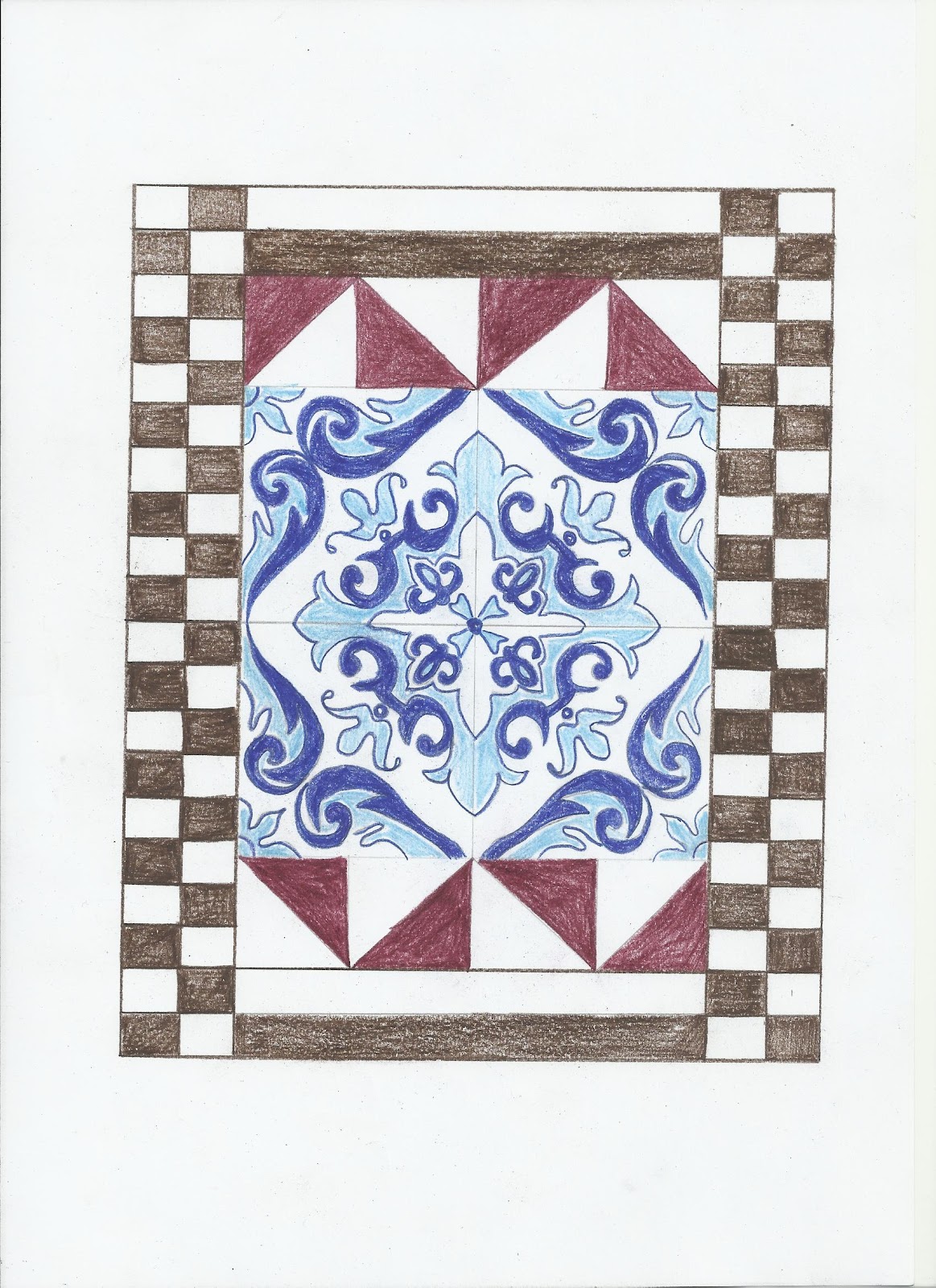
"Where Cultures Meet - Tiles"
Visual Treatment
1. Brief description: The inspiration for this piece was drawn from William Morris' concept of "tile" designs. Mainly for aesthetic purposes, this piece shows two kinds of tiles - normal tiles that you could find anywhere (the border), and also Nyonya tiles (in the middle) which come in sets of fours.
2. Art Movement: Art and Craft Movement
3. Reference Artist: William Morris
4. Theme: Society and Culture
5. Ideation and Concept: This piece is mainly to create awareness of the dying arts in Malaysia, as Nyonya tiles are now a collector's item and a set of Nyonya tiles can fetch quite a high price. This piece also shows a mix in culture, namely traditional versus modern culture, and also a reminder of the Baba Nyonya culture which can be found in Malaysia.

"Where Cultures Meet - Her Shoes"
Visual Treatment
1. Brief description: The inspiration for this piece was drawn from William Morris' concept of "tile" designs. Mainly for aesthetic purposes, this piece is divided into four quadrants, two showing an old traditional "feet-binding" shoe used by the Chinese, and the other two quadrants show a pair of ribbon laced contemporary high-heeled shoes which a girl could wear dancing.
2. Art Movement: Art and Craft Movement
3. Reference Artist: William Morris
4. Theme: Society and Culture
5. Ideation and Concept: This piece is symbolic in three ways.
- It symbolizes freedom; the purpose of the shoe for feet-binding in the past was because small feet were considered beautiful for Chinese women. From the piece, you can see two contrasting concepts; control, represented by the red traditional feet-binding shoe, and freedom, represented by the purple high heel shoes.
- Indirectly, the design of the shoe also signifies freedom of speech and opinions. The “closed-toe” on the feet-binding shoe represents how Chinese women in the past were not heard whereas part of the high-heels exposes the foot, representing how Chinese women now have a voice.
- It symbolizes a similarity in human nature; women in the past and women in the present still torture their feet for the sake of vanity.

"Where Cultures Meet - Congkak?"
Visual Treatment
1. Brief description: The inspiration for this piece was drawn from William Morris' concept of "wallpaper" designs. Mainly for aesthetic purposes, this piece shows the traditional game "congkak", as well as a modern (and rather surprising) way you can play this game - digitally, on an iPhone!
2. Art Movement: Art and Craft Movement
3. Reference Artist: William Morris
4. Theme: Society and Culture
5. Ideation and Concept: This piece is mainly to create awareness of the dying arts in Malaysia, as "congkak" was once a game played by all people as a pass time. From personal experience, "congkak" could be considered a dying form of leisure as it is hardly seen nowadays. However, due to the advances in technology, "congkak" has been reborn, but in a different way!
Sunday, 26 February 2012
The Sketching Process
Art Movement: Art and Craft Movement
Inspiration: William Morris
Theme: Society and Culture
I first attempted to define society and culture. Society is defined as a group of people related to each other through persistent relations, and have formed companionship and association-ship. Culture on the other hand talks about forms or stages of civilization.
Drawing out tips from a conversation I had with a friend from the Mass Comm department, I decided to use a mindmap to creatively churn out ideas. I ended up with 6 main categories that would be able to depict culture:
1. The Malaysian Culture
2. Art
3. Music
4. HELP Culture
5. Collectivistic vs. Individualistic Societies
6. Traditional vs. Modern culture


Back to the ideas of a mixture of cultures in Malaysia, I started doodling different floral designs that had different cultural backgrounds to them, namely the three main cultures in Malaysia (ie: Malay, Chinese and Indian). I incorporated the repetitive style that William Morris used in his tile art.


Sketch 17
Pop Culture - Coffee

Inspiration: William Morris
Theme: Society and Culture
What comes to mind when I think of culture and society?
I first attempted to define society and culture. Society is defined as a group of people related to each other through persistent relations, and have formed companionship and association-ship. Culture on the other hand talks about forms or stages of civilization.
Drawing out tips from a conversation I had with a friend from the Mass Comm department, I decided to use a mindmap to creatively churn out ideas. I ended up with 6 main categories that would be able to depict culture:
1. The Malaysian Culture
2. Art
3. Music
4. HELP Culture
5. Collectivistic vs. Individualistic Societies
6. Traditional vs. Modern culture

Above: Mind Map
Problem Statement: Our Country, Malaysia is rich with culture. Why then, are some dying? How are some cultures evolving?
Research Question: Are we apathetic toward our country's culture?
Purpose: To pique the interest of Malaysian locals and to raise awareness of present as well as past cultures as well as to increase appreciation for the cultures and evolving society of our nation.
Points to keep in mind:
- Art and craft movement championed authenticity, local traditions and diversity (ie: varying kinds of materials to create not only paintings, but also tiles, wallpapers etc.)
- Depending on project, elements that can be incorporated: flattened graphic appearances, symmetry, using colour to highlight certain elements of the piece
- Attention to detail is important
- Goal of art and craft movement: To create designs for the people, by the people. that can be a source of pleasure to the viewer and maker.
Above, top from left: Jasmine wallpaper, floral spray tile, Membland- Tile Wallpaper
Abobe, bottom from left: Coffee with William Morris, William Morris Floral Sampler
Sketches

Sketch 1
Bunga Raya - A symbol of Malaysian culture
Bunga Raya - A symbol of Malaysian culture
I started off by thinking of Malaysian culture. The first thing that came to mind was the hibiscus, the national flower. So I tried to draw a hibiscus motive, adapting the elements of the art and craft movement by giving the flowers a flattened graphic appearance, while keeping in mind the detail of the flower.

Sketch 2
Ketupat
Malaysians love their food! I wonder how many people still have the knowledge of hand-weaving this traditional delicacy. I decided to create a "wallpaper" theme to remind us of this.

Sketch 3
Nelayan?
With older cultures and traditions in mind, I decided to sketch something for those in communities that make a living with the ocean as their source of living. The circular lines represent the waves that surround the boat when they are being used out in the ocean, the danger that the people had to go through in their struggle to live everyday.

Sketch 4
Wau

Sketch 5
Wow!
What are some arts that are seen less nowadays? The Wau which used to be a form of games and entertainment is now viewed as more obsolete and an "art". Much attention to detail was necessary in Sketch 4. I suddenly had a thought and decided to improve on that sketch, and I came up with Sketch 5.

Sketch 6
Endure
The next few designs delve into more Chinese motives. This one, Endure, shows a pot of bamboo. It symbolizes how our culture and traditions are "trapped" within a "restricted area" with all the modernization and commercializing of occasions etc. The bamboo was used to represent strength and perseverance, and it is also reflected on the word in the pot.

Sketch 7
Where Cultures Meet-
Where Cultures Meet-
Artist-sticks
My brain storms extended to a new concept - where cultures meet. I then decided to do something that was done during the art and craft movement period, which was to use a variety of materials. I used two different means, Chinese brush and pen, to illustrate the difference in Chinese culture. Once upon a time, the Chinese wrote and drew with the Chinese brush and ink, but not so today.
My brain storms extended to a new concept - where cultures meet. I then decided to do something that was done during the art and craft movement period, which was to use a variety of materials. I used two different means, Chinese brush and pen, to illustrate the difference in Chinese culture. Once upon a time, the Chinese wrote and drew with the Chinese brush and ink, but not so today.

Sketch 8
Where Cultures Meet -
Pasttime
Building on the idea of difference in culture, I decided to play on the idea of modernization reaching the rural areas. This sketch shows a kampung house, with a piece of ground that is for playing traditional games like marbles and tops. However, the people are inside the house, watching television. I realize that this picture did not carry out the full style of the art and craft movement, but it helped jog ideas throughout the process.

Sketch 9
Where Cultures Meet -
Apple?
Still playing on the ideas of two cultures meeting, I drew a tree. An apple tree to be precise. The inspiration came from when I bought an Apple product, and a friend asked, "So.. did you buy an apple?", and instinctively thinking she meant the fruit, I said "Nope", when in fact I had. It reflects on the perceptions of cultures. Say "apple" to someone of older generations, they would only think of the fruit. Say "apple" to a person of this generation, and you may get a totally different reaction.
Still playing on the ideas of two cultures meeting, I drew a tree. An apple tree to be precise. The inspiration came from when I bought an Apple product, and a friend asked, "So.. did you buy an apple?", and instinctively thinking she meant the fruit, I said "Nope", when in fact I had. It reflects on the perceptions of cultures. Say "apple" to someone of older generations, they would only think of the fruit. Say "apple" to a person of this generation, and you may get a totally different reaction.

Sketch 10
When Cultures Meet -
When Cultures Meet -
Batik
I thought of my favourite textile - batik designs. With textiles in mind from the art and craft movement, I decided to play on the idea of old culture being engulfed by new culture, similar to what the art and craft movement was working very strongly against (ie: they were trying to preserve the local traditions and were against mass production of materials with no authenticity)

Sketch 11
Where cultures meet
The Door(s)
I am from a mixed heritage, with Eurasian blood running through my mother's side of the family. The Door on the right reminds us of the Baba Nyonya culture, whereby their doors were decorated with intricate designs. The idea of this sketch is to communicate how many things have become rigid with the absence of fine designs. Attention should be drawn to the door on the right. The doors are also closed symbolizing closed minds and how current generations have forgotten cultures as such.

Sketch 12
Where Cultures Meet-
Her Shoe
None of us really know how hard it was as a Chinese female in the olden days and how they had to suffer wearing the Chinese Shoes. This sketch not only reminds about the tradition, it also reflects how culture has changed and reminds modern day females about how they are not required to bind their feet anymore (you can see part of a foot in the modern shoe.

Sketch 13
Where Cultures Meet -
Flora
Back to the ideas of a mixture of cultures in Malaysia, I started doodling different floral designs that had different cultural backgrounds to them, namely the three main cultures in Malaysia (ie: Malay, Chinese and Indian). I incorporated the repetitive style that William Morris used in his tile art.
Sketch 14
Where Cultures Meet-
Tiles
Again drawing a tile design, I played on the Baba Nyonya culture again. The 4 middle tiles are the decorated tiles that have come to be considered as an antique art. People nowadays pay a considerable amount of money to own a set of 4 tiles as such. The border shows a more mundane tile design, probably something that is more commonly seen.

Sketch 15
Where Cultures Meet-
Where Cultures Meet-
Music
This idea of different cultures of music turned out to be very symbolic. The blue coloured area draws your attention to the middle of the sketch. The blue with a straight lined stave represents serenity and a pure melody. The red which the stave eventually becomes, symbolizes distortion and anger, which much of the music today has become, full of violence and dysfunction. If you look clearly, you can also see that the notes on the red line area are irregular and big and scary looking, and they are pushing the smaller notes on the blue lined area. It represents music now infiltrating the music that used to be, to the extend of pushing out the older music that did have better values, more melody, and more structure.
This idea of different cultures of music turned out to be very symbolic. The blue coloured area draws your attention to the middle of the sketch. The blue with a straight lined stave represents serenity and a pure melody. The red which the stave eventually becomes, symbolizes distortion and anger, which much of the music today has become, full of violence and dysfunction. If you look clearly, you can also see that the notes on the red line area are irregular and big and scary looking, and they are pushing the smaller notes on the blue lined area. It represents music now infiltrating the music that used to be, to the extend of pushing out the older music that did have better values, more melody, and more structure.

Sketch 16
Pop Culture - Games
Again, this sketch depicts a difference in cultures. Technology has become such an integral part of our lives. Even young children are seen playing games on sophisticated technological devices. The occurrence of traditional games such as congkak has somewhat ceased. However, you may be surprised to know that it is available as a phone application.

Sketch 17
Pop Culture - Coffee
This sketch represents the "lepak" or "hanging-out" culture, and shows how much the coffee culture has changed. The bigger cup represents the current more "expensive coffee" culture. The six cups of coffee on the inside of the cup are the number of cups of coffee you could get in a traditional coffee shop. Today, youngsters like to meet in "commercialized coffee shops" where there is air-conditioning and bright lights - alas they also pay much more for what they get.

Sketch 18
Understanding Minds
This sketch is representative of the culture of psychology. Those in the psychology field strive to understand minds and study the behaviour of those around.
Chosen Sketches:
Sketch 9
Where Cultures Meet -
Apple?
Elements of design analysis-
Line: Mostly organic lines, straight lines for border
Shape: Organic lines, to create a flow for main subject
Value: Dark subject on light background
Colours: Natural colours, harmonious
Texture: Flattened appearance
Alignment and proportion: Background more or less evenly spaced, subject somewhat symmetrical
Eye movement: Movement mostly in repetition and visual rhythm
Principles of design-
Hierarchy : Hierarchy starts with the subject (tree and apples) subsequently the leaves and background
Balance: A sense of symmetry with the entire piece covered in a repetitive background
Emphasis and variety: Emphasis on subject (apples) which have a distinct colour. Variety of colours used, mostly harmonious.
Harmony and unity: Harmony and unity is present as images come together to create a meaningful whole.
Sketch 12
Where Cultures Meet-
Her Shoe
Elements of design analysis-
Line: Subject mostly organic, straight lines used for border
Shape: Organic lines mostly used
Value: Dark subject on light background
Colours: Mostly dark, lighter colours for motive/designs on subject.
Texture: Flat, with attention to detail
Alignment and proportion: No symmetry in particular, background motive more or less evenly spaced
Eye movement: First eye movement will be to the subject, subsequently background movement in repetition and visual rhythm
Principles of design-
Hierarchy : Hierarchy falls on shoe first, background then border.
Balance: Assymetrical, but works together to produce harmony overall
Emphasis and variety: Emphasis on the subject. A variety of colours are used.
Harmony and unity: Harmony and unity is present as images come together to create a meaningful whole.
Sketch 14
Where Cultures Meet-
Tiles
Line: Straight lines used for the border but organic lines for to create emphasis to the centre motive
Shape: A mixture of straight and organic lines
Value: Dark design on light background
Colours: Natural colours, harmonious
Texture: Flat, with close attention to detail
Alignment and proportion: Objects more or less evenly spaced, symmetrical design
Eye movement: Movement in repetition and visual rhythm (predictable design)
Principles of design-
Hierarchy : Attention is drawn to the centre 4 tiles
Balance: Symmetrical
Emphasis and variety: Emphasis on the Baba Nyonya tile, attention is drawn to its complexity
Harmony and unity: Harmony and unity is present as images come together to create a meaningful whole.
Subscribe to:
Comments (Atom)